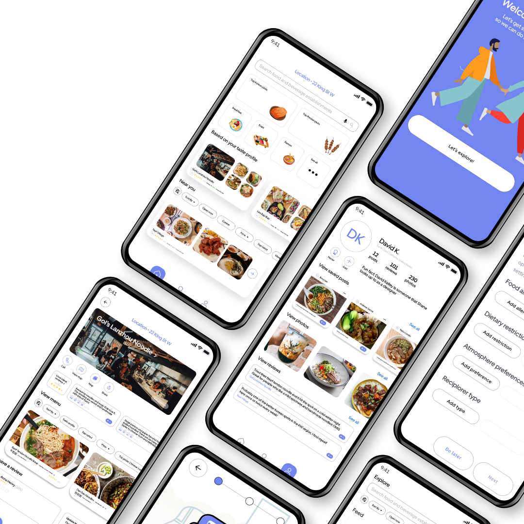
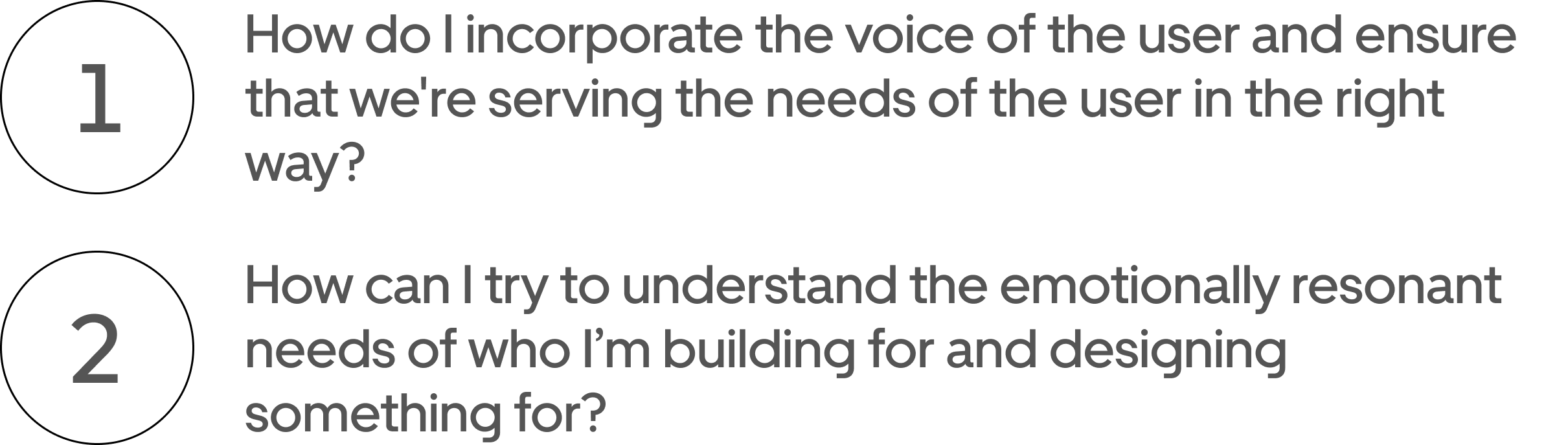
Reciplore is an app that's informed and influenced by an understanding of what people need to break the cultural barriers of food. The beauty of design thinking is that it's human-centered and we have the opportunity to reframe the problem from the customers point of view. I designed this app to help users to feel confident and comfortable learning about different ethnic cuisines while ordering at restaurants or cooking at home. Its core functions aim to bring community, search easily according to your catered taste profile, and make food more accessible with guides to users that would otherwise be incomprehensible to them.
Reciplore, resolving the cultural disconnect of food.
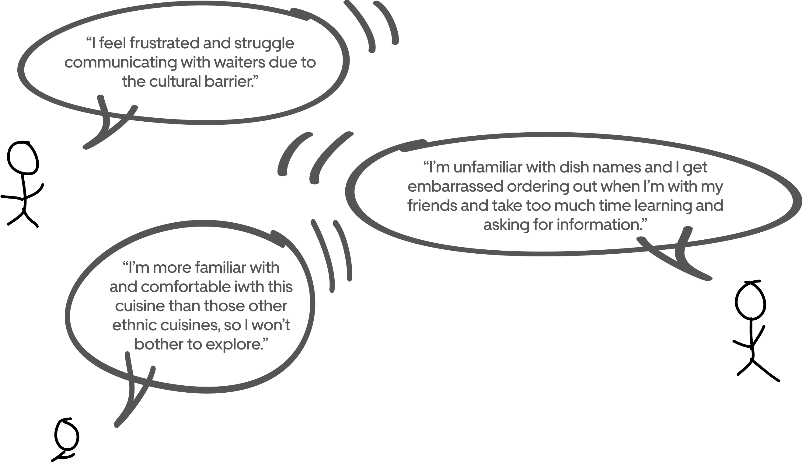
Solution: The user's information is spent for a more curated exploration result specifically for the user to better communicate, comprehend, and feel while ordering/making food in restaurants with cultural barriers. The taste profile seeks to give recommendations and warnings through the users choices, but it still gives the user control over redoing and filtering their options later on in the homepage.
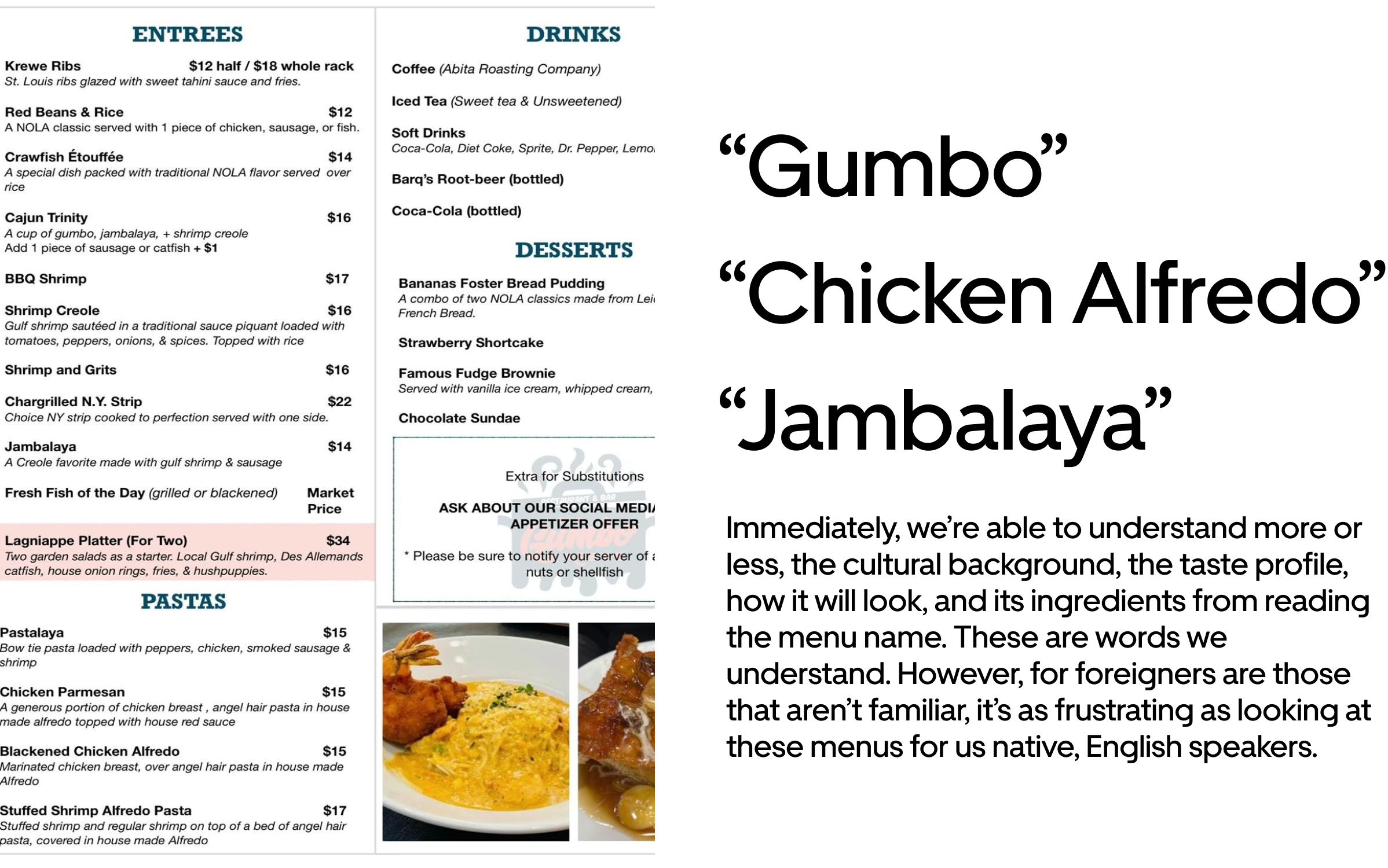
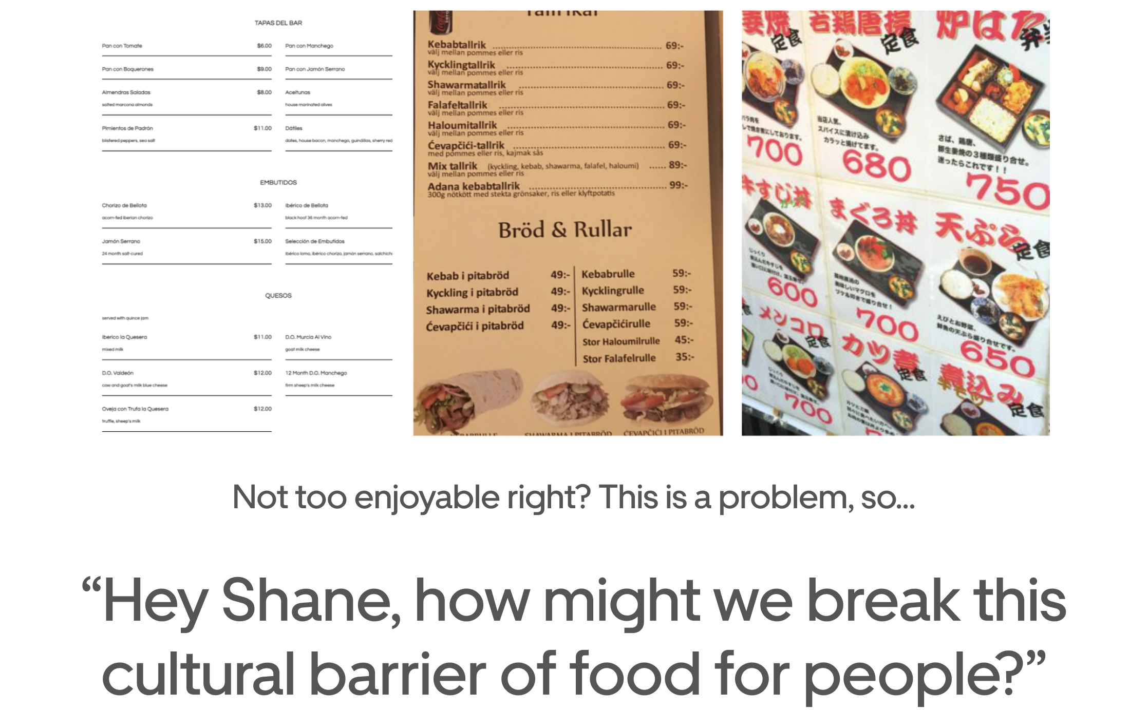
Below lists explanations of how the design is a solution to aforementioned pain points and problems across the user experience:
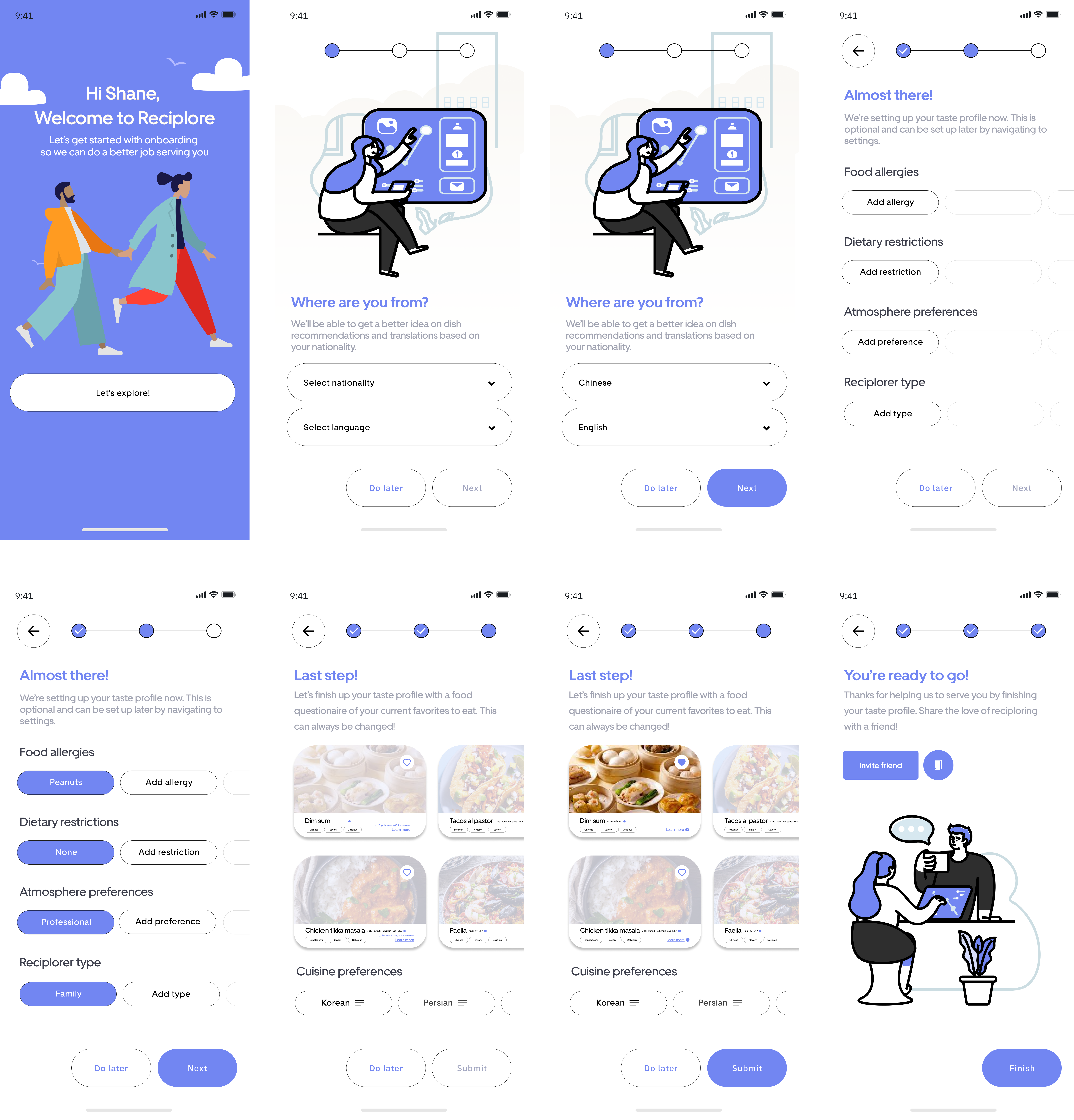
- The taste profile builds confidence as per the Maslow's hierarchy of needs by listing concrete steps to be carried out
- Microinteractions help users journey through the process (inactive vs. active buttons when questions are being filled out, colours fill in users tap a filter/option, progress bar as the user goes through the onboarding)
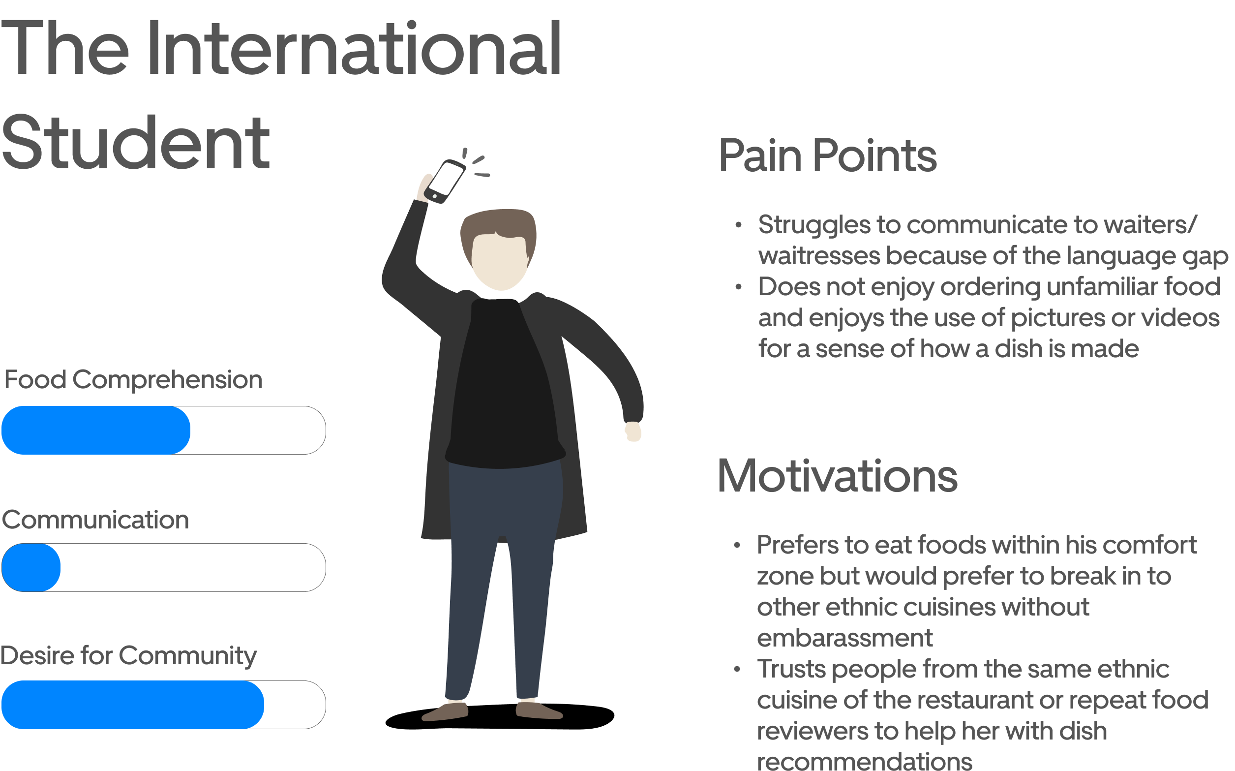
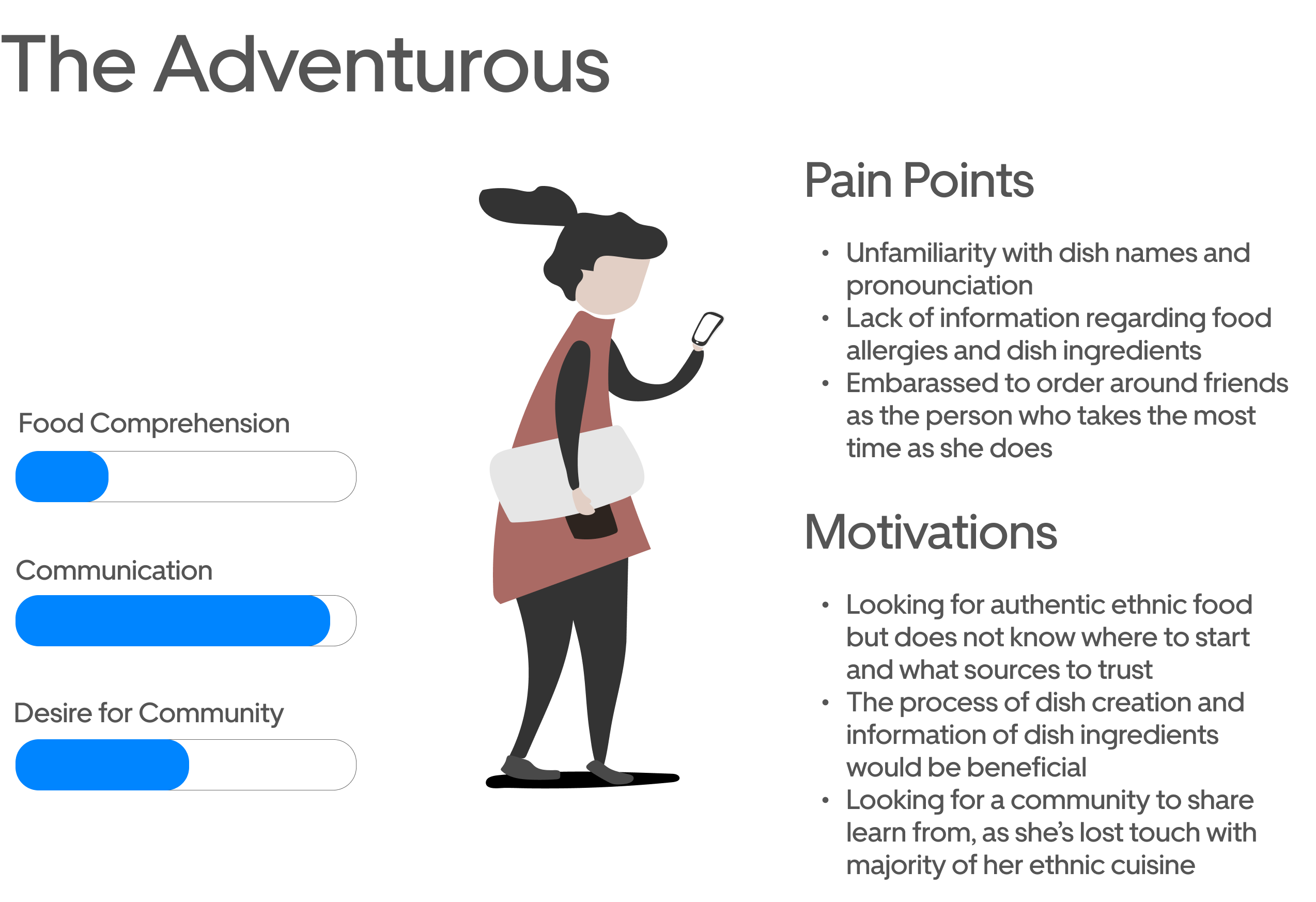
- Provides accessibility filters to find preferences in atmosphere, diet, and food allergies
- Plethora of food filtering options as users swipe right (for content in galleries, users like to swipe right)
- Easily learn additional information (ingredients, restaurant options, recipes, etc) through help buttons about each dish
- Clear, simple, and concise design that helps users embrace the adventure