Parking in the city is a time-sink and often an inconvenience when we find ourselves parking in spots much further from the destination than expected. At times, we would rather avoid the frustration of driving in the city altogether and brave the unpredictability of public transit, or pay the hefty expenses of alternative transportation.
Parker
Your city guide
The Problem
The Solution
How can we make the process of those facing these problems as efficient and pain-free as possible?
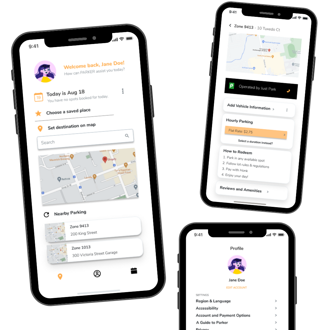
Parker lets you do it all from an internet connected device. The app houses all information on all possible parking spots in the city; both in-garage and on-street, including settings to sort by accessiblity, price and location. Leave Parker to handle it by reserving spots on the app and take control of your day!
The Research
I first looked into the market to examine the existing products and how they help people better save time and money parking in the city.

I found that:
- The competitors all had a simple design layout choosing to use colour as a method to emphasize important information, but PayByPhone and Passport were not the easiest to use as zone information is not readily available for reserving spots beforehand.
- Users are able to see amenities of parking spots on Honk Mobile, but are not able to see reviews or accessiblity ratings that could be solved by crowdsourcing this information through their app.
- People need to search for the nearest parking spot by scrolling around on the map in Passport or PayByPhone instead of having a sort/filter feature built-in on the app.
- The apps used discernible map icons, plenty of white space and the UX in Honk Mobile of having nearby parking spots on its main page was extremely helpful.
Therefore, I hope to create a tool that tailors to the need of the public by saving them time and money to do more while actually doing less through Parker. Every parking app does this, but Parker strives to do more even after booking your slot, recommending local attractions near your reserved slot and acting as a guide during that time. Parker, your city guide.
Design Goals
Competitive analysis concluded with me striving for a friendly and easy design layout; plenty of white space and colour to emphasis the important information. Another point of emphasis for me was providing a strong UX with tailored recommendations on nearby attractions at the parked spot, sort/filter features with crowdsourced accessbility ratings and photos, and using location services to provide a list of nearby parking spots on the homepage.
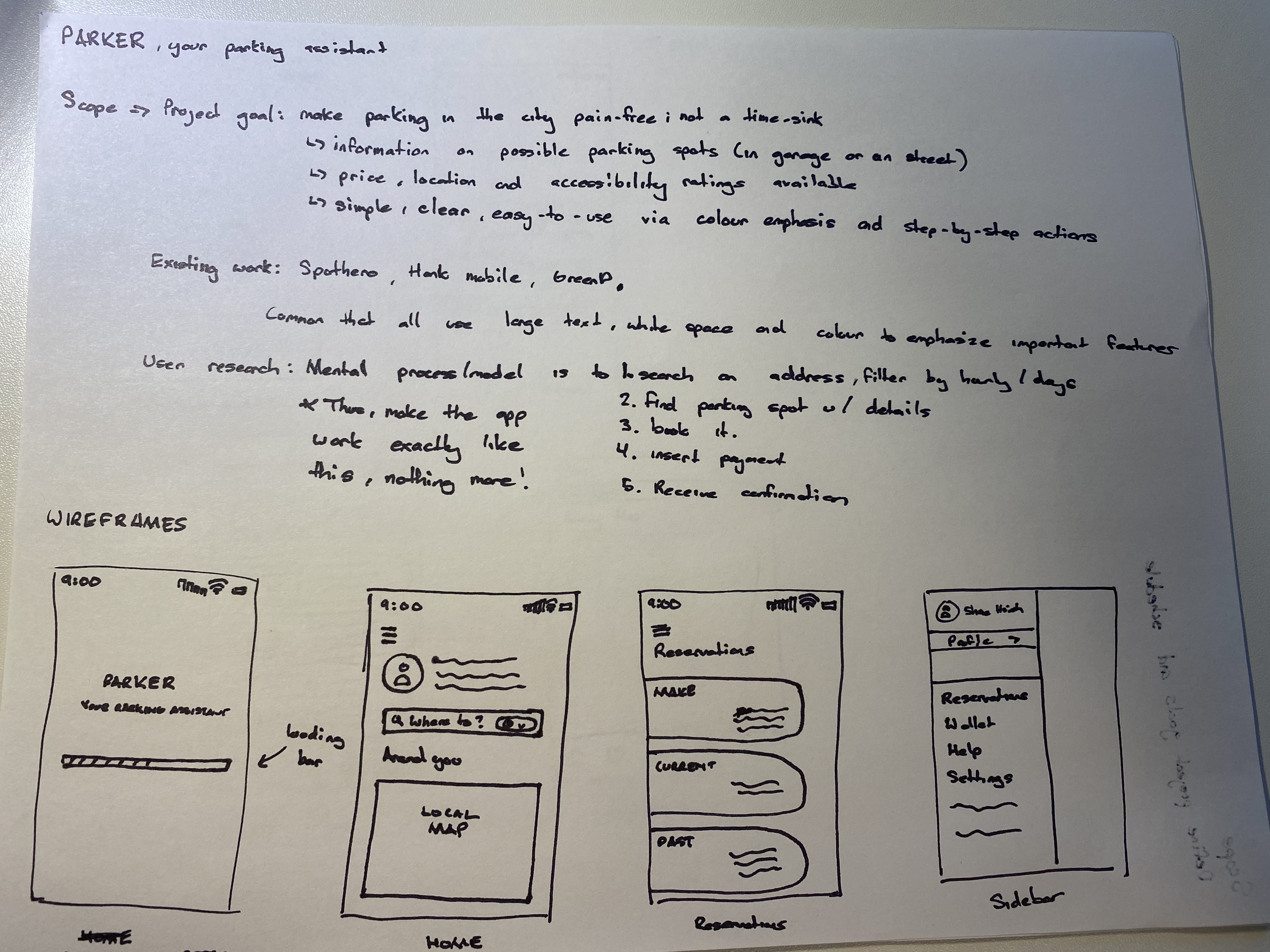
Design Decisions
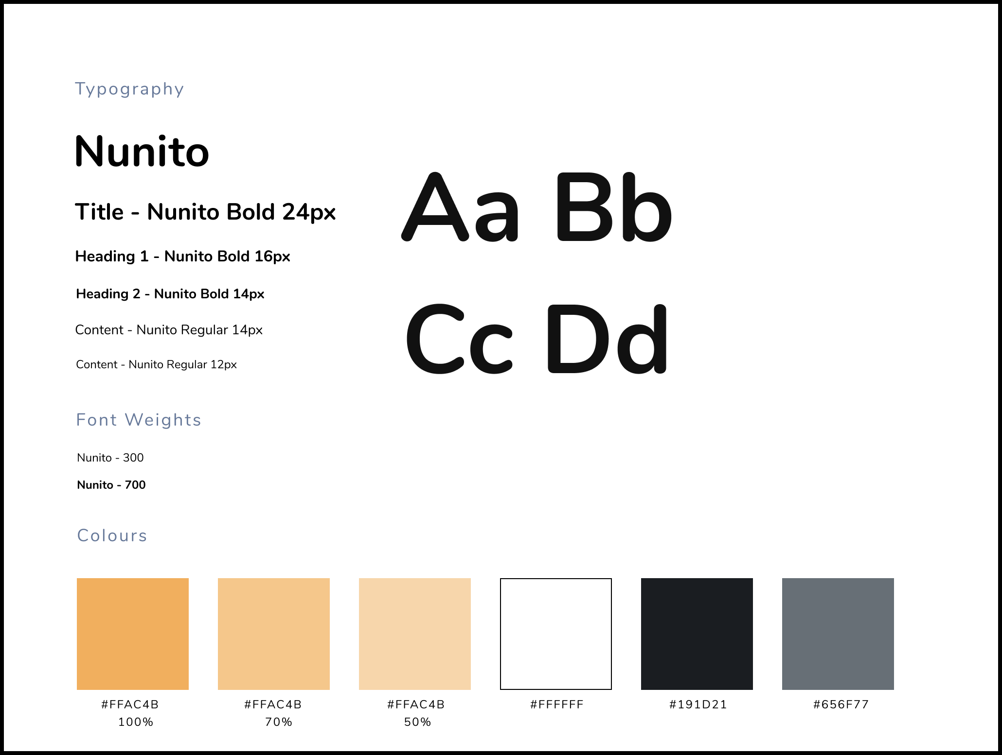
For the typography and colour palette, I wanted to create a set guide for future reference when I develop the app more. The color palette is greyscale for the most part, but I used shades of orange to invoke in the users mind feelings of excitement, enthusiasm, and warmth when they're planning their day and to encourage users to spend more time enjoying the city. In addition, creating a modern user interface was another decision that came to fruition as I wanted the app to provide a centralized and accessible hub for people to navigate through without it being a time-sink in terms of figuring out how to use Parker.
Design Solution
Here's the latest prototype of Parker using Marvel with some of my updated changes. Further changes to the design based on feedback will be posted soon.
Reflections
This is my first case-study, and I know I can grow a lot as a UX designer if I keep on trying. I'm still learning my strengths and weaknesses, but I had a lot of fun with Parker. Here are some quick notes of reflection:
- Gamifying the experience could encourage people to write accessbility ratings, as this feature is completely crowdsourced. One way to do that is to get stickers and badges on ones profile, or to even use a leaderboard with rewards to incentivize users.
- Personas could have been developed to better guide me to emphatize with who would use this product or to find for certain my target demographic.
- Brainstorming with other designers would have been cool.
- Developing iterations of each wireframe would have been good to get feedback on through surveys and receiving user feedback.
- The amount of white space might be excessive and I think I could have used my space better, especially on the search page.